CLIENT:
The Children's Society
PROJECT:
Brand purpose & design
Purpose & identity
We worked with The Children’s Society to create a dynamic new vision for the future that would both reposition the brand and inspire the whole organisation.
A youth charity in need of a contemporary refresh
Despite over a century of great work helping the most vulnerable young people in the UK, The Children’s Society were struggling with low awareness and needed a dynamic new vision for the future.
Our mission was to create a new strategic purpose and a distinctive identity that would ensure The Children’s Society stands out in a crowded children’s charity sector.

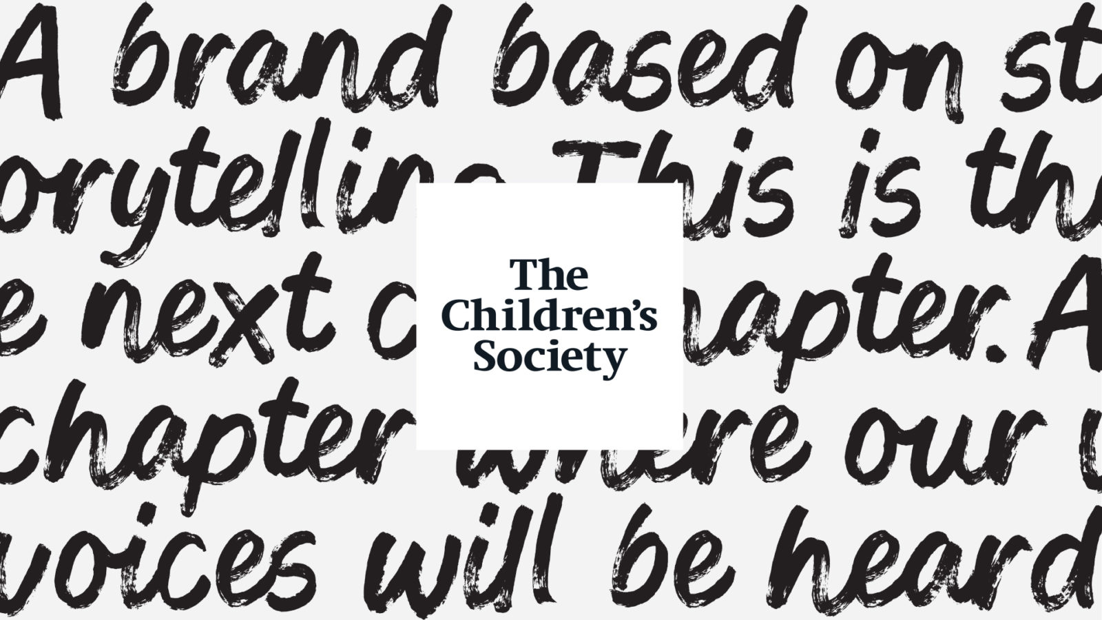
From hard truths to optimism
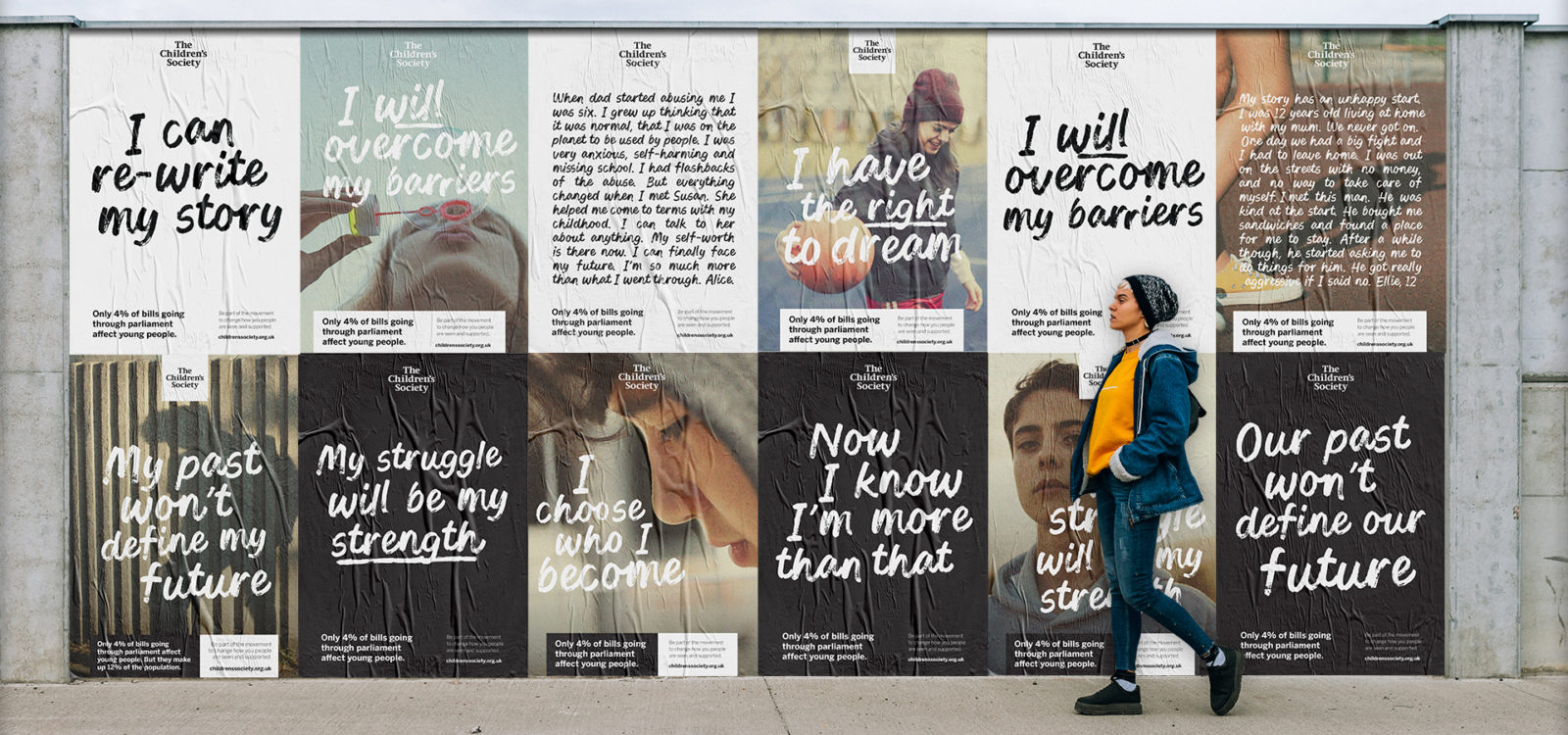
The previous branding portrayed young people as ‘victims’ through a gloomy reportage style, making them the subject of conversation. We knew we needed to turn this on its head to reflect optimism instead of tragedy and to allow young people to tell their own stories.
An organisational shift was needed to put these young people at the heart of the charity. And thus, The Children’s Society’s new purpose ‘Keep youthful optimism alive’ was created.
Defining what we meant by ‘optimism’ was key before undertaking brand identity work. Optimism is not always bright colours and happy, smiling people. It can be the gritty resilience to get out of a difficult situation. This spirit was articulated in the brand idea ‘Fighting for hope’.

A brand platform for young people’s voices
The purpose ‘Keep youthful optimism alive’ provides an ideal platform for young people to be heard. Central to the brand was the distinctive shift from ‘voice of the organisation’ to ‘voice of young people’. This meant authenticity was going to be key.
Championing collaboration
We co-created the new brand with the young people supported by The Children’s Society – asking them how they wanted to be represented – and ran extensive quant and qual testing with a range of existing supporters and new prospects.
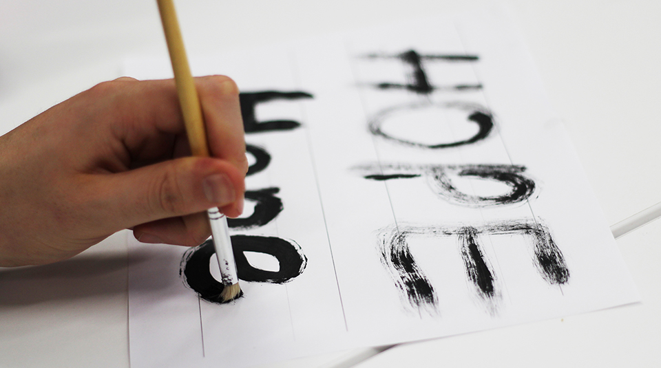
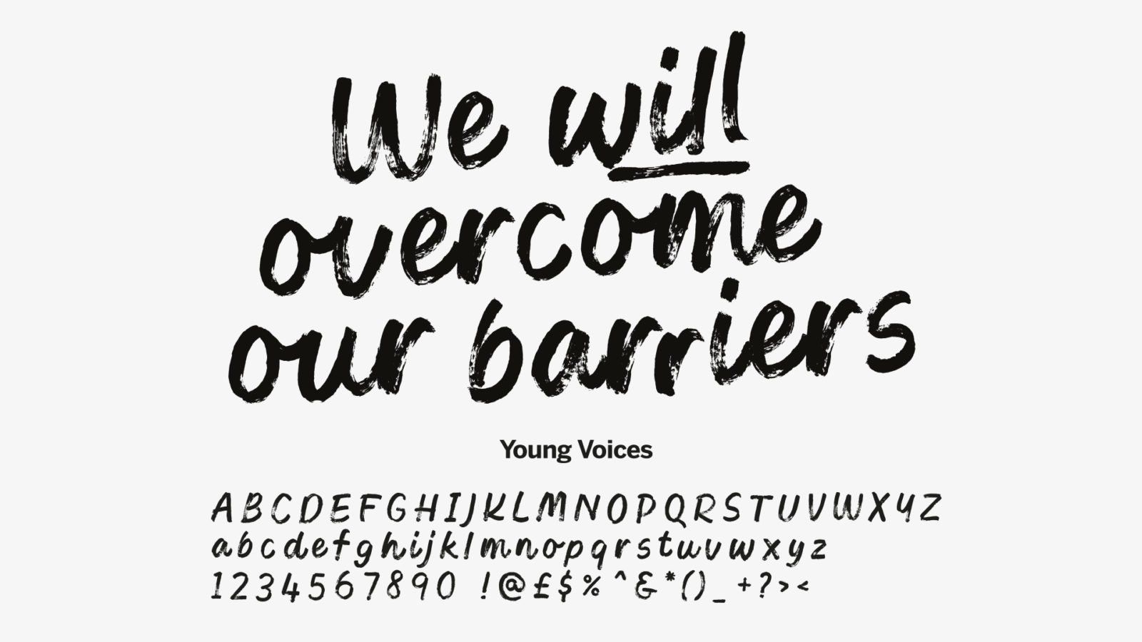
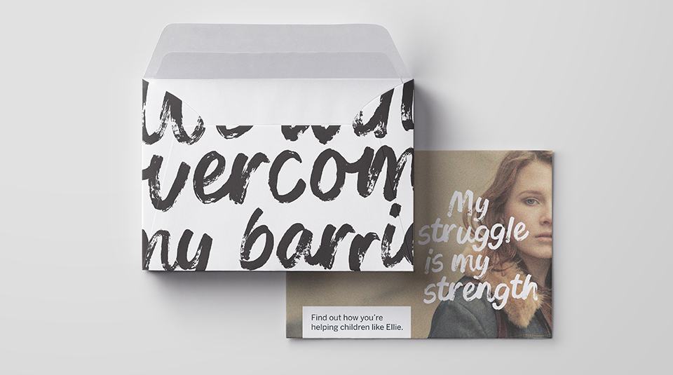
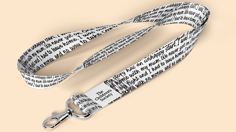
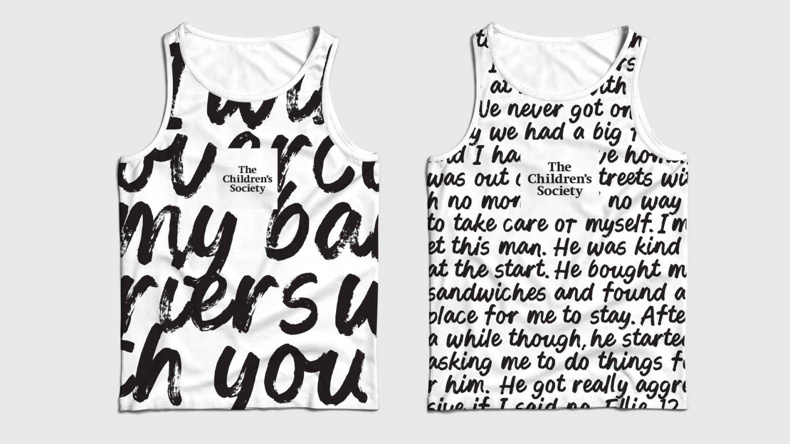
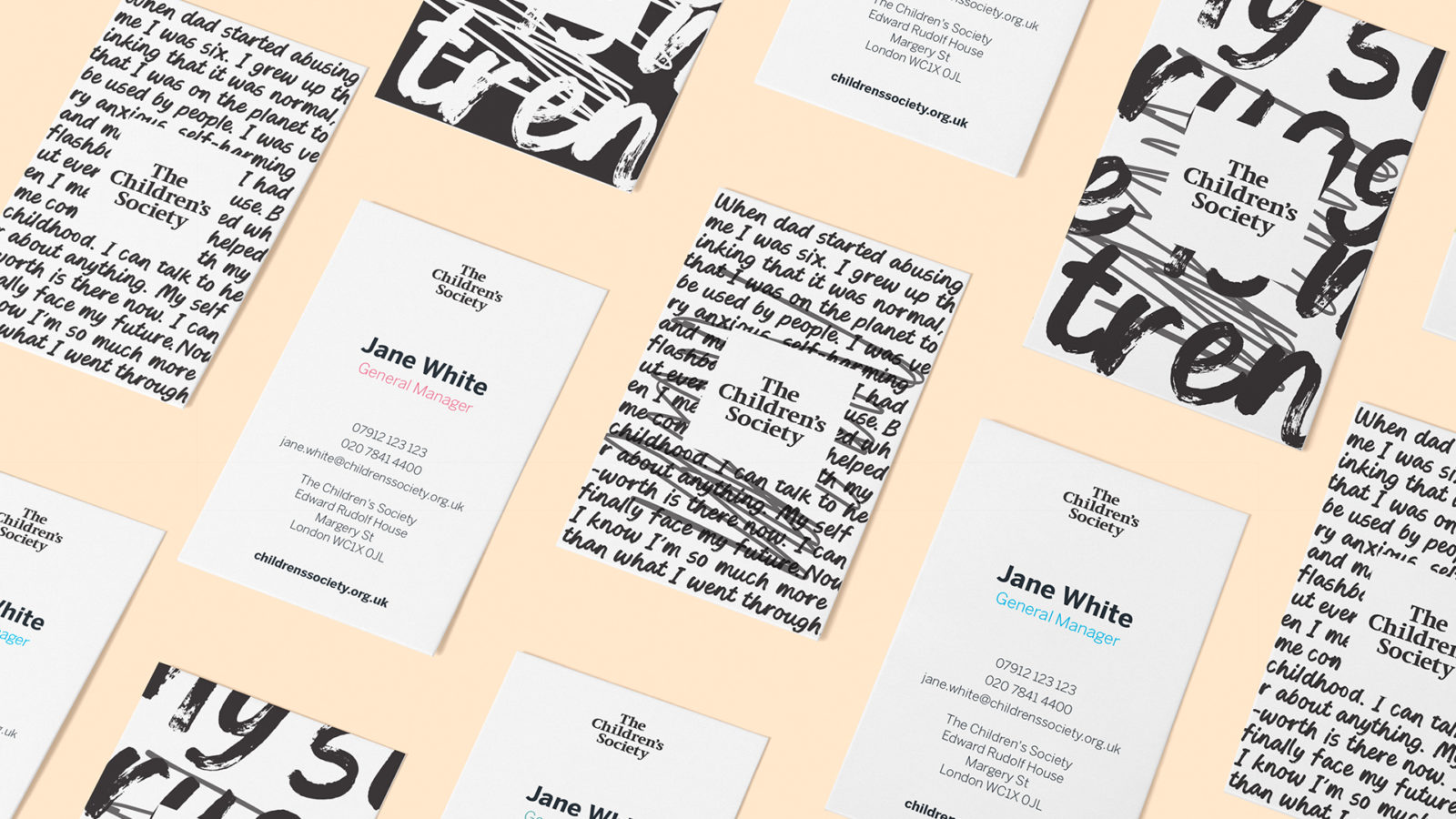
Because we wanted to deliver an authentic message from young people, an authentic approach to typography was going to be crucial. This led us to collaborate with a font foundry to lead a co-creation workshop with a group of the vulnerable young people The Children’s Society works with. The result is a bespoke typeface, ‘Young Voices’; an ownable brand asset that represents the unheard young people in desperate need of a voice.
Articulating optimism visually
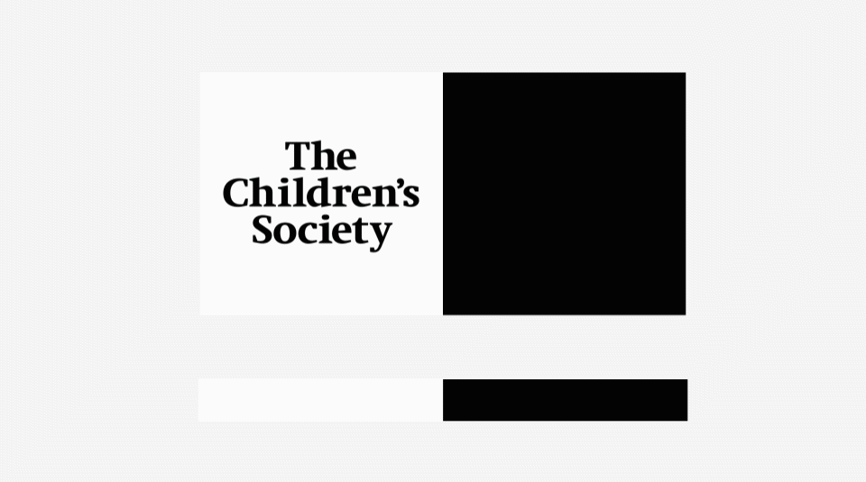
Keeping the wordmark and black and white colour palette allowed us to build on existing brand recognition, as well as achieve distinction in a sector full of colour. Tweaking the 50/50 colour ratio to be predominantly white, with black only serving as a secondary colour, allowed us to move away from a dark, pessimistic world to create a lighter, brighter brand identity that better delivered our brand message.
Moving away from ‘staged’ photography, with frightened children alongside adults in unauthentic backgrounds, to capturing young people in real urban, suburban and rural environments provided us with the authenticity key to the project.
Storytelling at its heart
The font allowed us to execute the idea of using the brand as a platform for authentic voices of young people across all brand executions. Now, typically plain and staid executions like business cards and lanyards become opportunities for young people’s stories to be heard.
Alongside a unified purpose, The Children’s Society can spread storytelling behaviour across the entire organisation.
A contemporary, youth-centric brand
The Children’s Society’s new purpose and redesign is currently being integrated into a refresh of all functions within the charity – from their flagship Christingle event to their vital legacy pipeline. The new brand has also inspired hundreds of new actions – from organic social content to an art exhibition of hopeful creations by young people.
‘Keep youthful optimism alive’ signifies the cultural shift in communications that the charity is making. And in doing so, The Children’s Society is set to become a contemporary, youth-centric brand that stands out and remains distinct within the crowded sector.