CLIENT:
Sue Ryder
PROJECT:
Re-brand
Purpose & identity
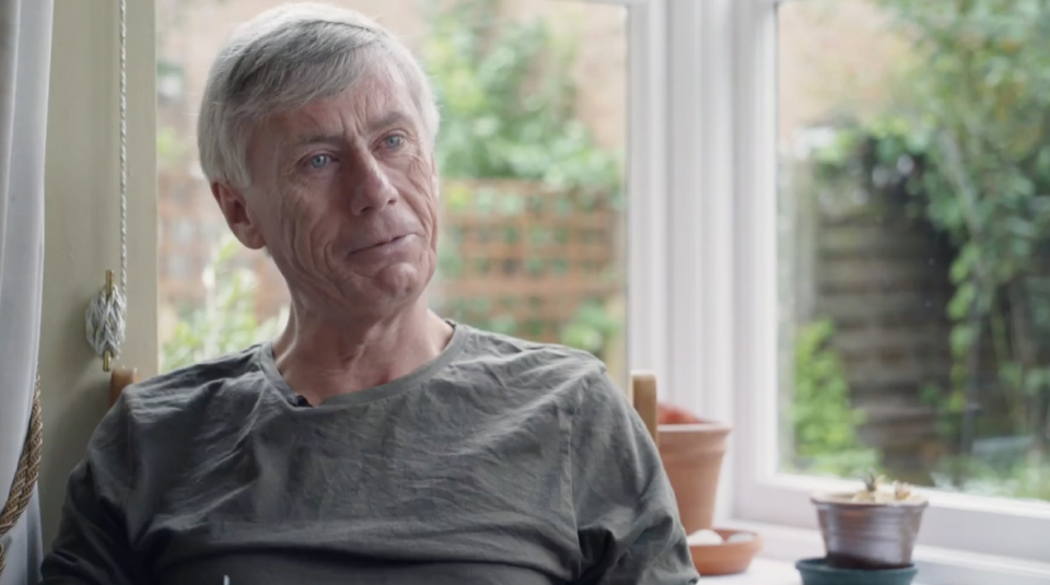
Sue Ryder is best known for its national chain of charity shops – but not for the amazing care and support it provides. We helped the brand re-engage with the wider public and communicate its offer more clearly.
A new brand purpose
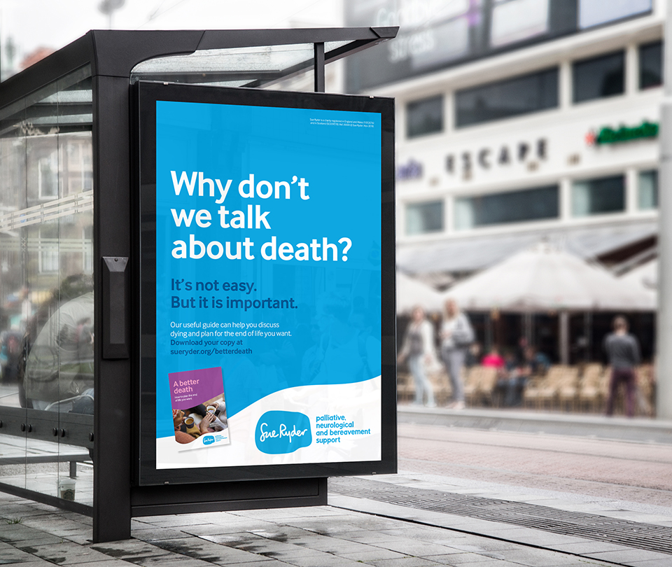
We looked at what made Sue Ryder different – and why it mattered so much to the people they cared for. This purpose had to work across a diverse range of offers, from palliative care to bereavement counselling as well as fundraising comms.
But it was the universal truth that ‘moments of truth’ in life are when we need someone to listen and appreciate us for who we are – a human, not a patient; a person, not a body.


Playing to their strengths
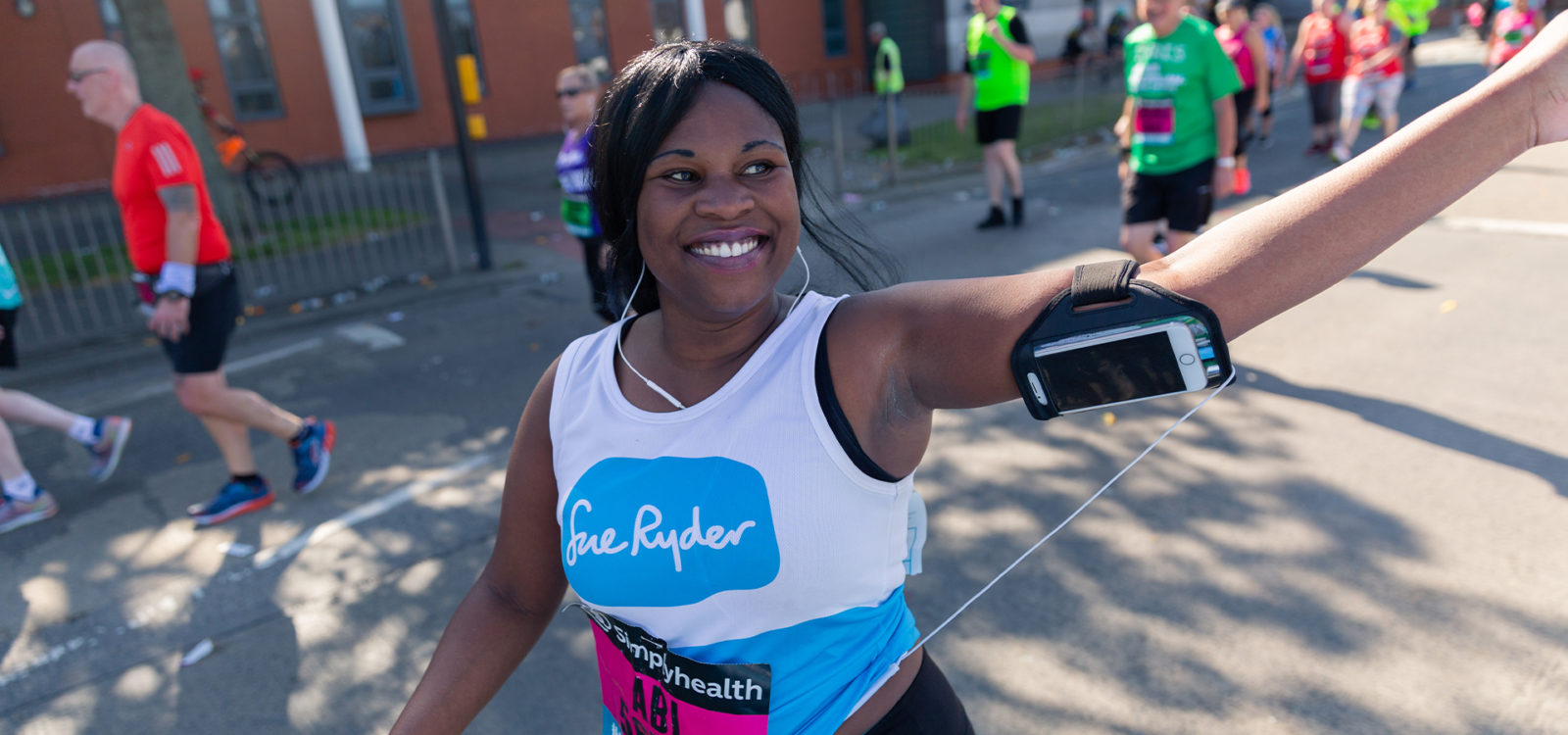
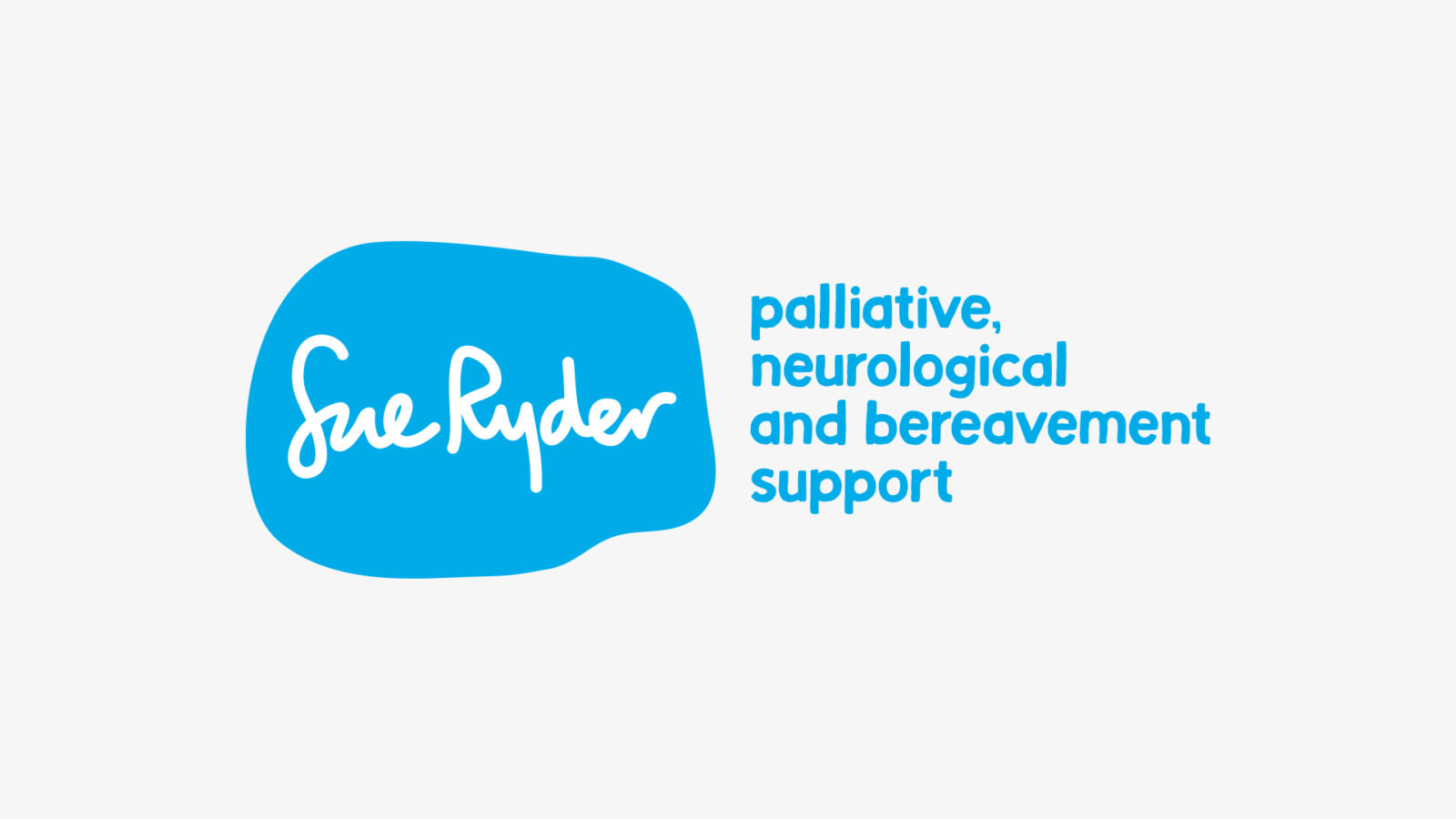
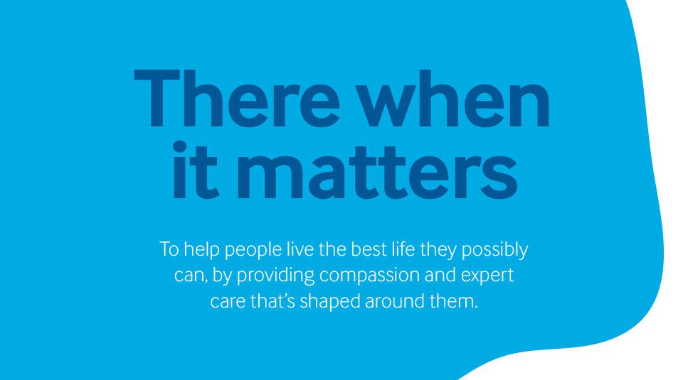
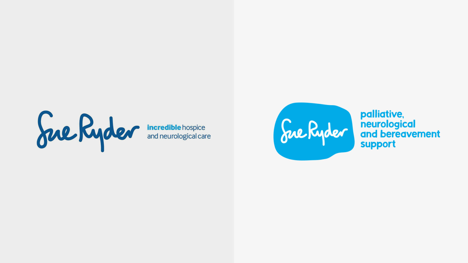
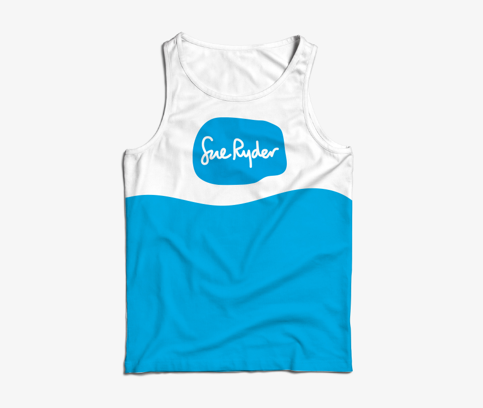
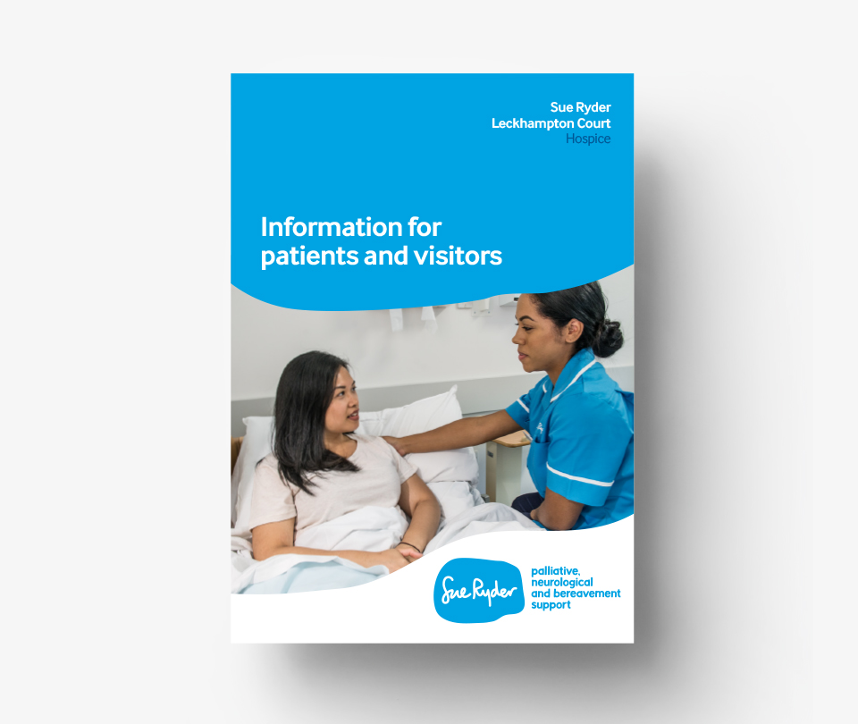
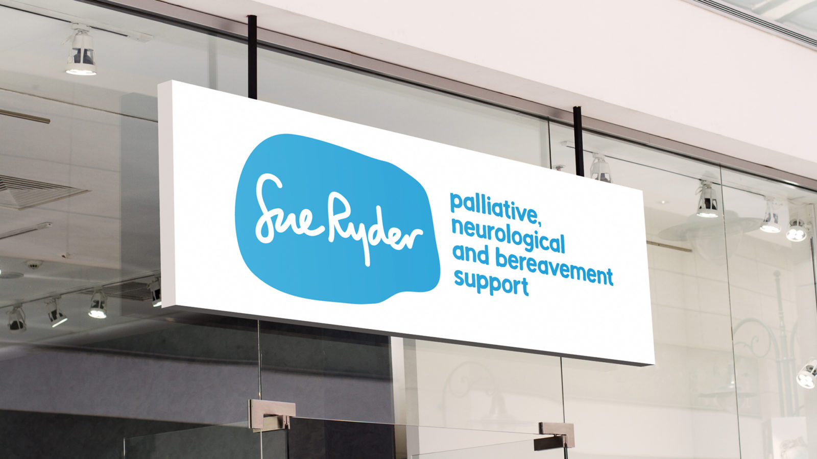
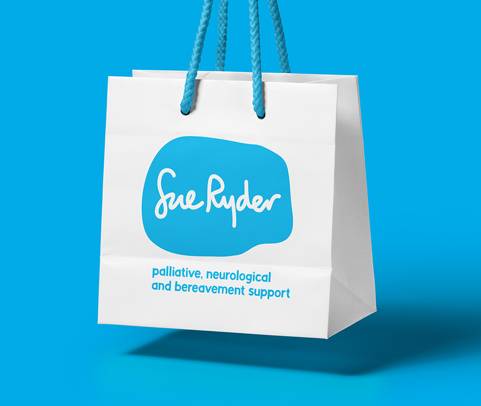
We wanted to play to Sue Ryder’s brand strengths, the greatest of which was perhaps their brand presence on the high street – with 450 stores across the country. With recognition high, but understanding and sentiment low, we re-drew and locked up Sue Ryder’s most recognised brand asset with a new strapline that articulates what the charity does.
Using a handmade font with irregular edges in their recognisable blue palette ensured the strapline was able to harmonise with the logo to feel like one brand mark.

Structure and flexibility
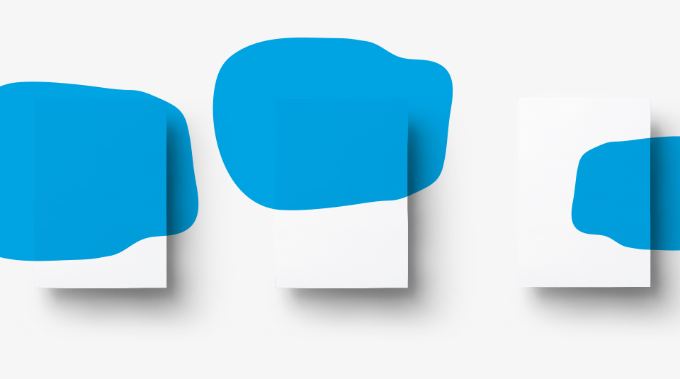
To ensure consistency we reduced four existing graphic devices to one. With many teams across the organisation needing a design system for various purposes, this easy-to-use graphic could be manipulated and cropped to provide flexibility.
To increase brand recognition, we reduced their colour palette and created new colour rations to ensure Sue Ryder’s recognisable blue featured more prominently.
Impact
Our brand work has given Sue Ryder a clear brand purpose that is core throughout the organisation, as well as a visual identity that plays to their strengths and helps generate recall.