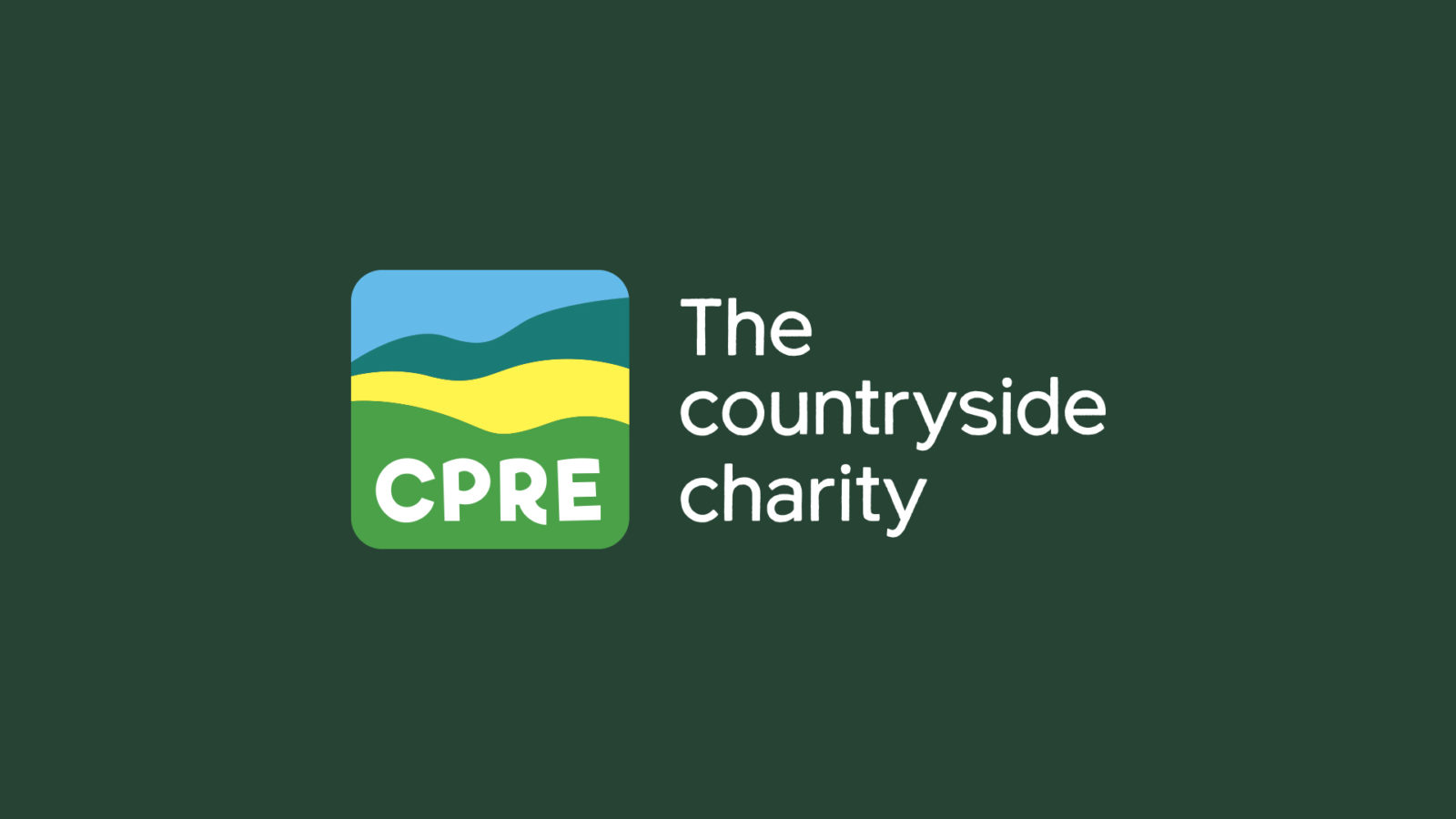
CLIENT:
CPRE
PROJECT:
Brand purpose & design
Purpose & identity
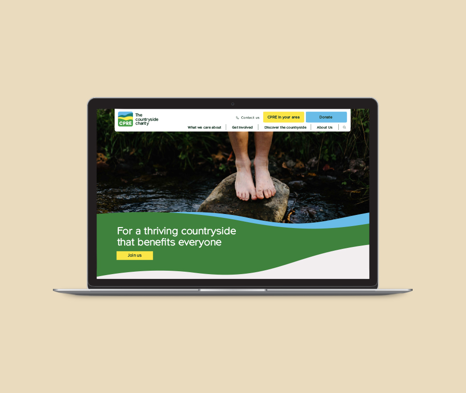
We worked with CPRE (Campaign to Protect Rural England) to define a new brand purpose and identity that would help them connect with a younger, more diverse audience.
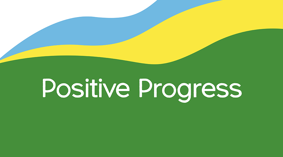
From protect, to progress
Research with potential new supporters showed that a future-facing and positive vision was important to inspire support and clearly communicate ‘why’ CPRE existed. It also showed that people were unable to easily understand what CPRE actually did, the ‘how’. Their breadth of work was much broader than just protecting the countryside, but their acronym placed them firmly in that space.
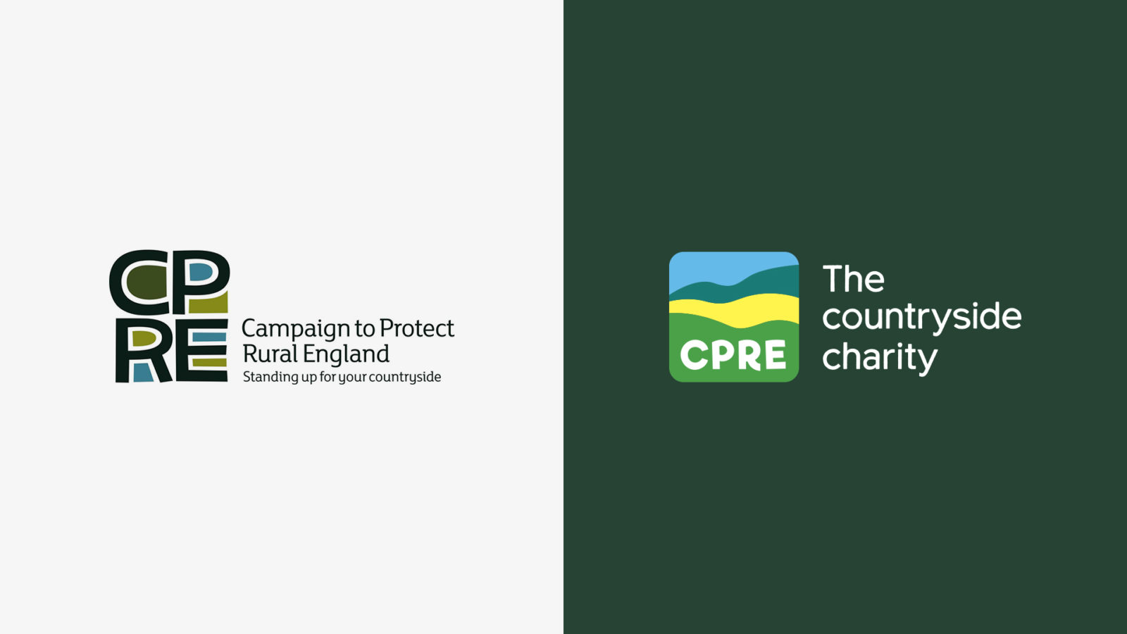
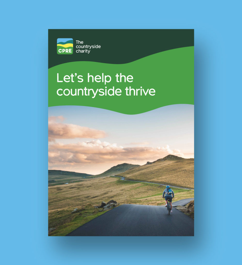
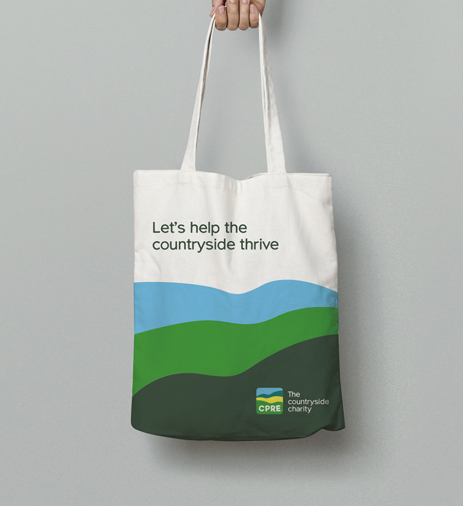
To tackle the ‘why’, we developed a new brand purpose centred on ‘Positive Progress’ which enabled CPRE to focus on the solutions that help progress the countryside and the impact those solutions can make, rather than the many threats to it. To ensure people better understood CPRE’s offer, we then agreed to align ‘CPRE’ with the supporting strapline ‘The countryside charity’.


Reminding people of the why
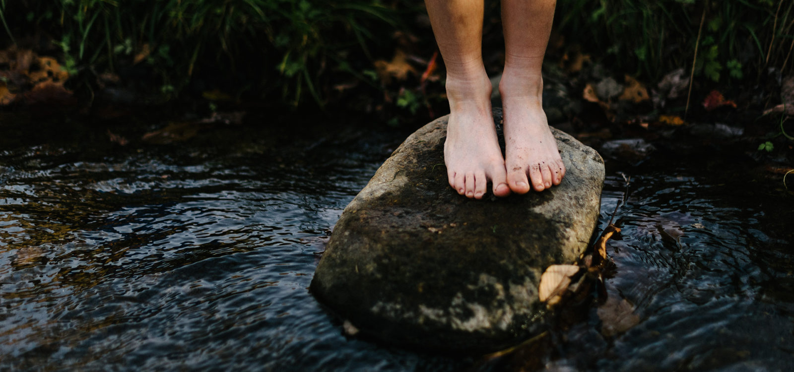
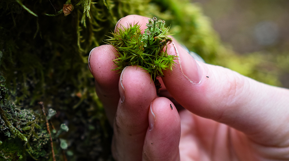
To remind people of ‘why’ they should care about the countryside we used imagery that evokes the experience being within the countryside, be it the dirt on your hands or the sensation of water on your feet.
To achieve distinction, we ensured every shot features human interaction. Imagery covered all aspects of the countryside from epic to intimate and detail.

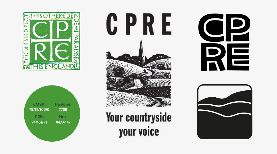
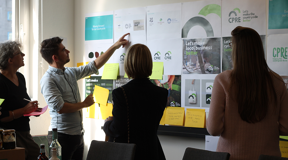
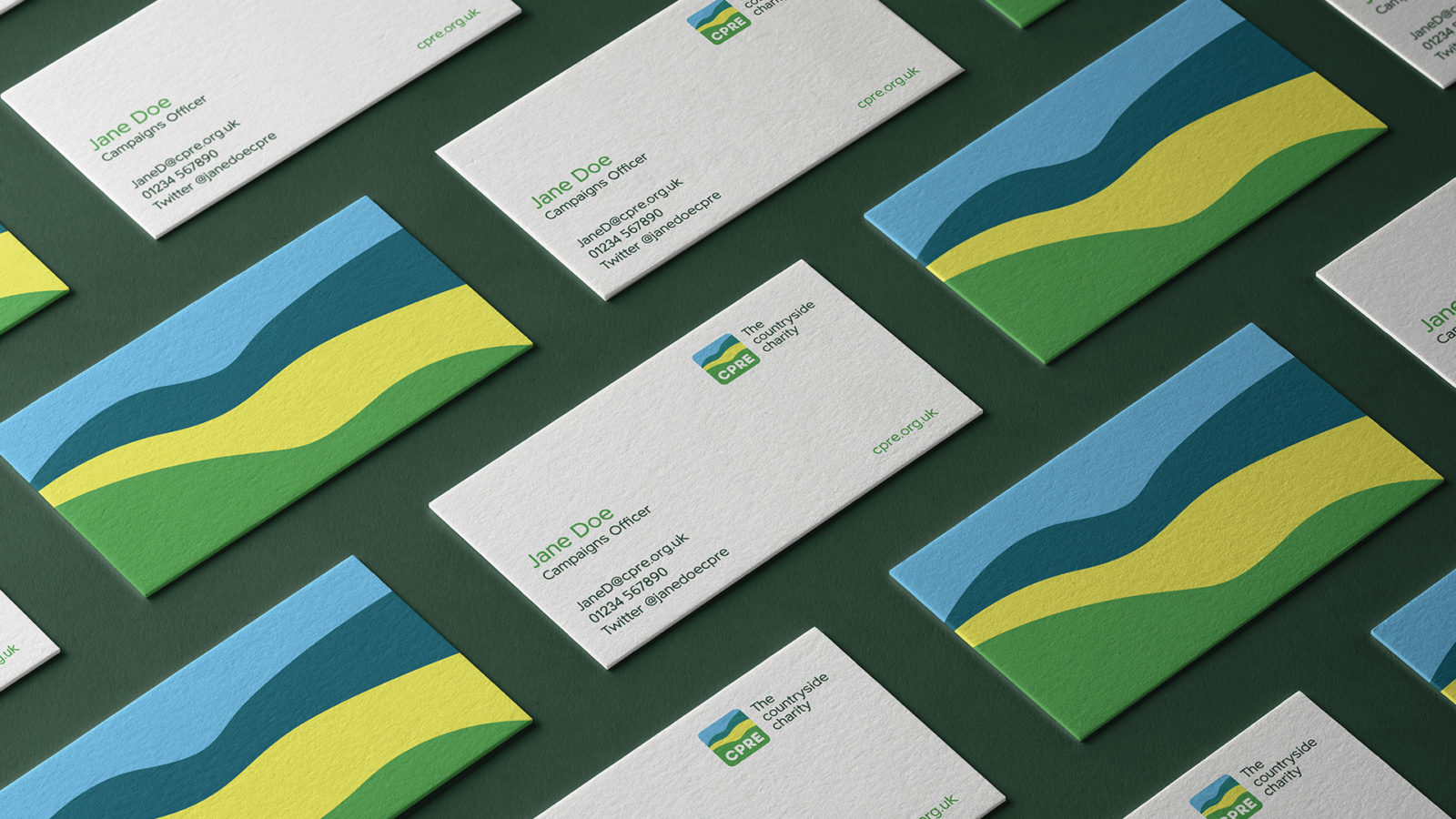
A symbol for the whole countryside
We also knew people wanted a symbol for the whole countryside, rather than a single aspect of it. Be it rolling hills or an aerial view of a coastal scene, people recall countryside scenes closest to them.
We trawled through the archives of CPRE’s 90+ year history while crafting the logo to ensure the brand remained familiar, and didn’t alienate existing supporters.
Made for the countryside, by the countryside
To ensure we created an authentic brand, we used the countryside to construct it. This is most evident in the colour palette, where we got out of the office and selected a range of positive colours from the countryside itself.
Armed with a bold new purpose and brand identity to match, CPRE has been able to unite the organisation around a single purpose.
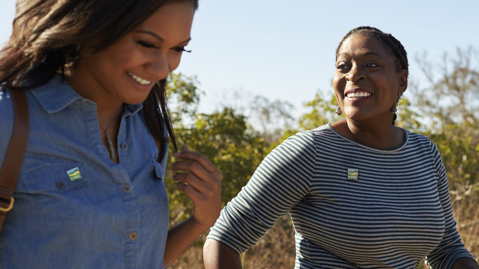
A united and future facing organisation
Armed with a bold new purpose, and brand identity to match, our CPRE re-brand has seen the entire organisation unite around a singular purpose.