CLIENT:
National Oceanography Centre
PROJECT:
Brand Purpose & design
Purpose & identity
A new purpose and rebrand for the ground-breaking, game-changing National Oceanography Centre.
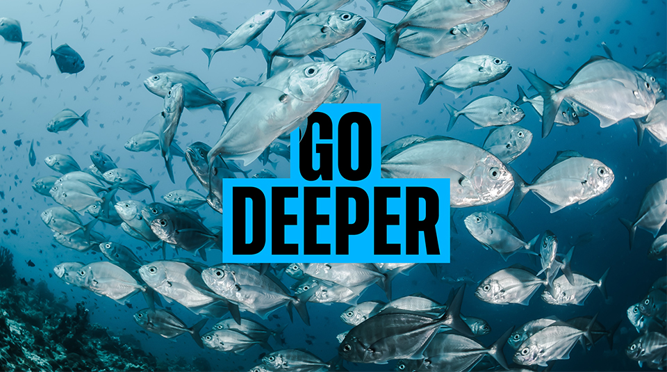
Go Deeper
The ocean is the lifeblood of our planet. Which makes the world-class research of the National Oceanography Centre (NOC) crucial to our future. They needed a purpose to unite their stakeholders and bring the importance of their ground-breaking work to the public.
Through intensive stakeholder workshops, we successfully developed the organisation’s new purpose: To build a world where everyone feels empowered and inspired to help our oceans thrive. Then we brought the purpose to life with a bold, new brand idea: Go Deeper.
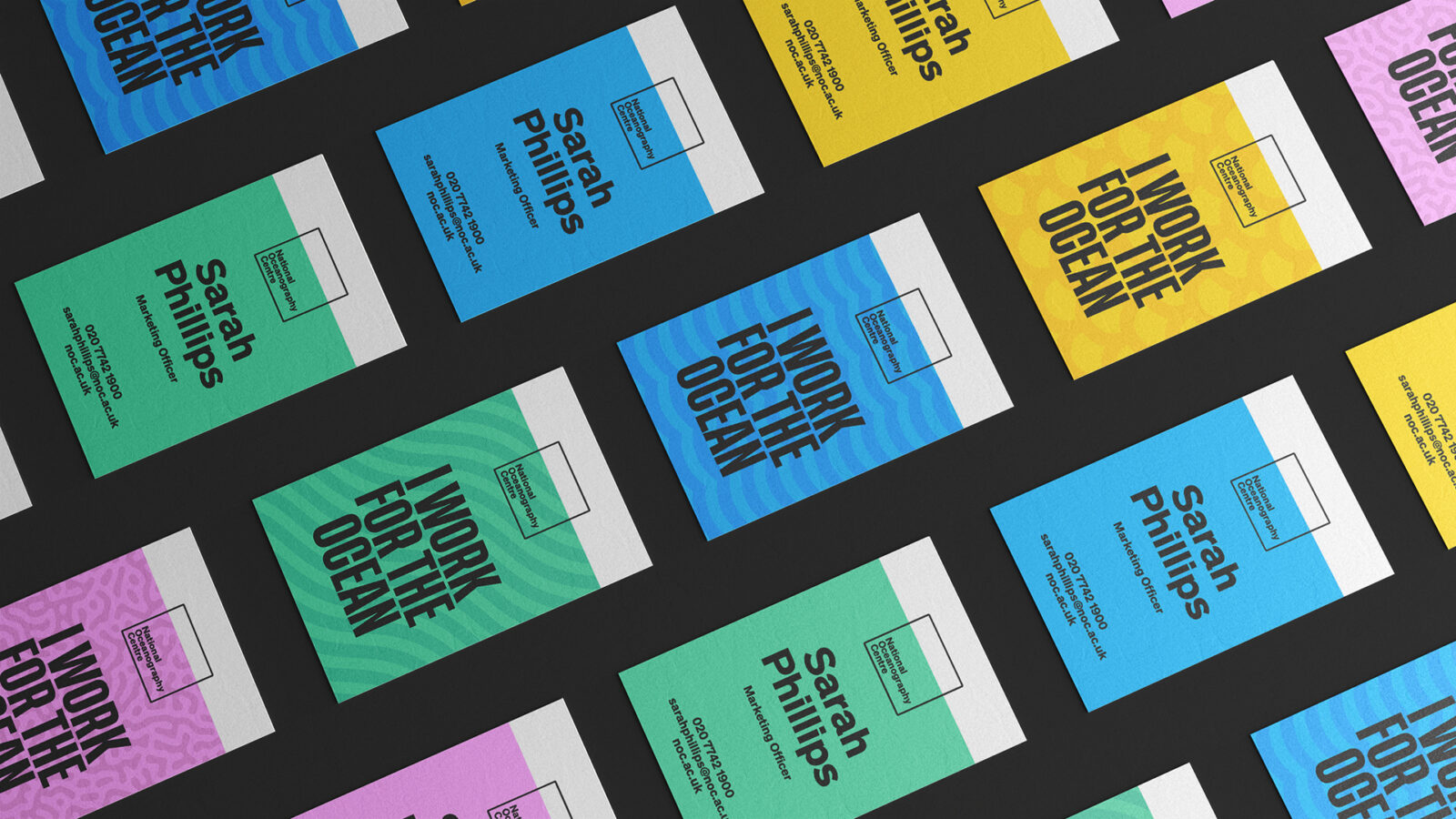
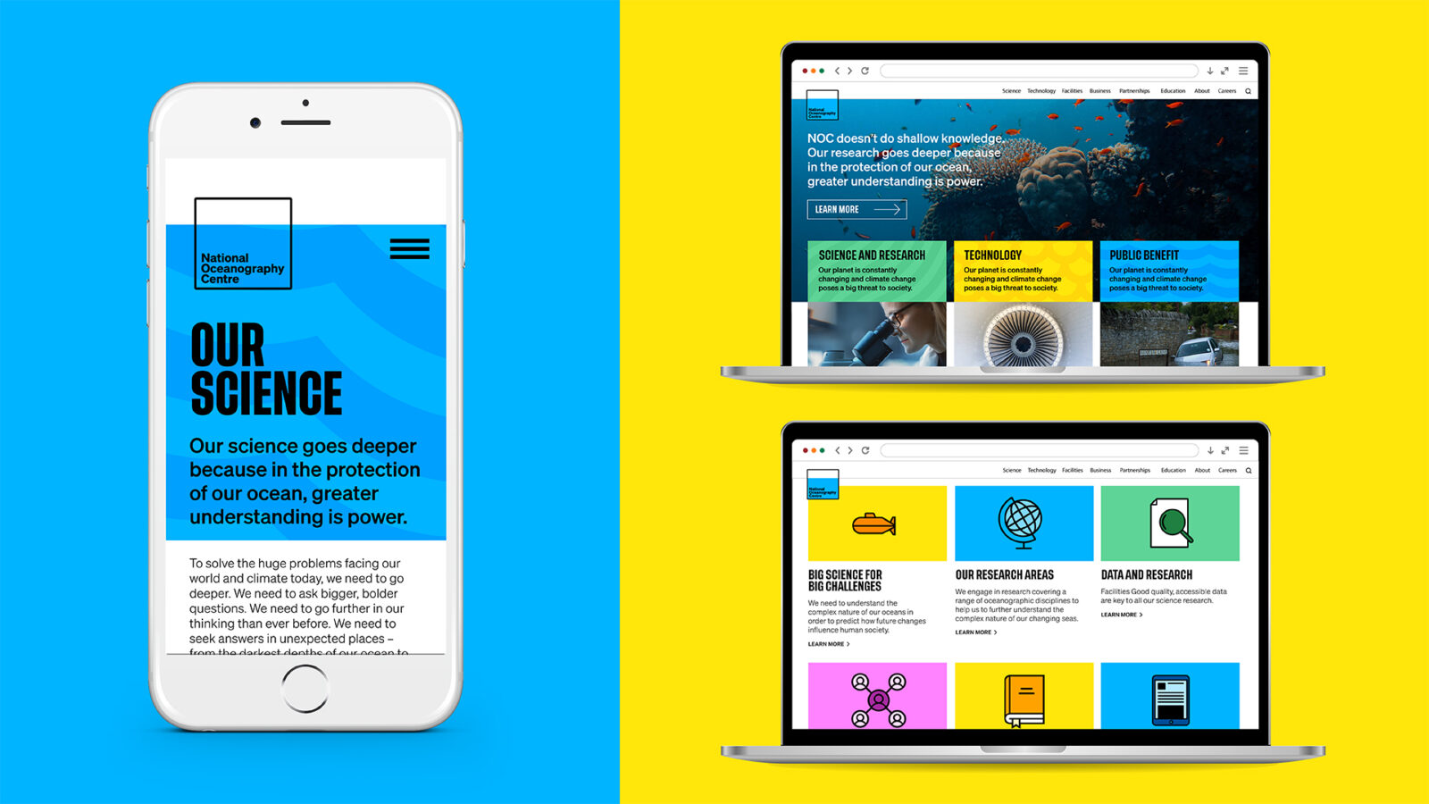
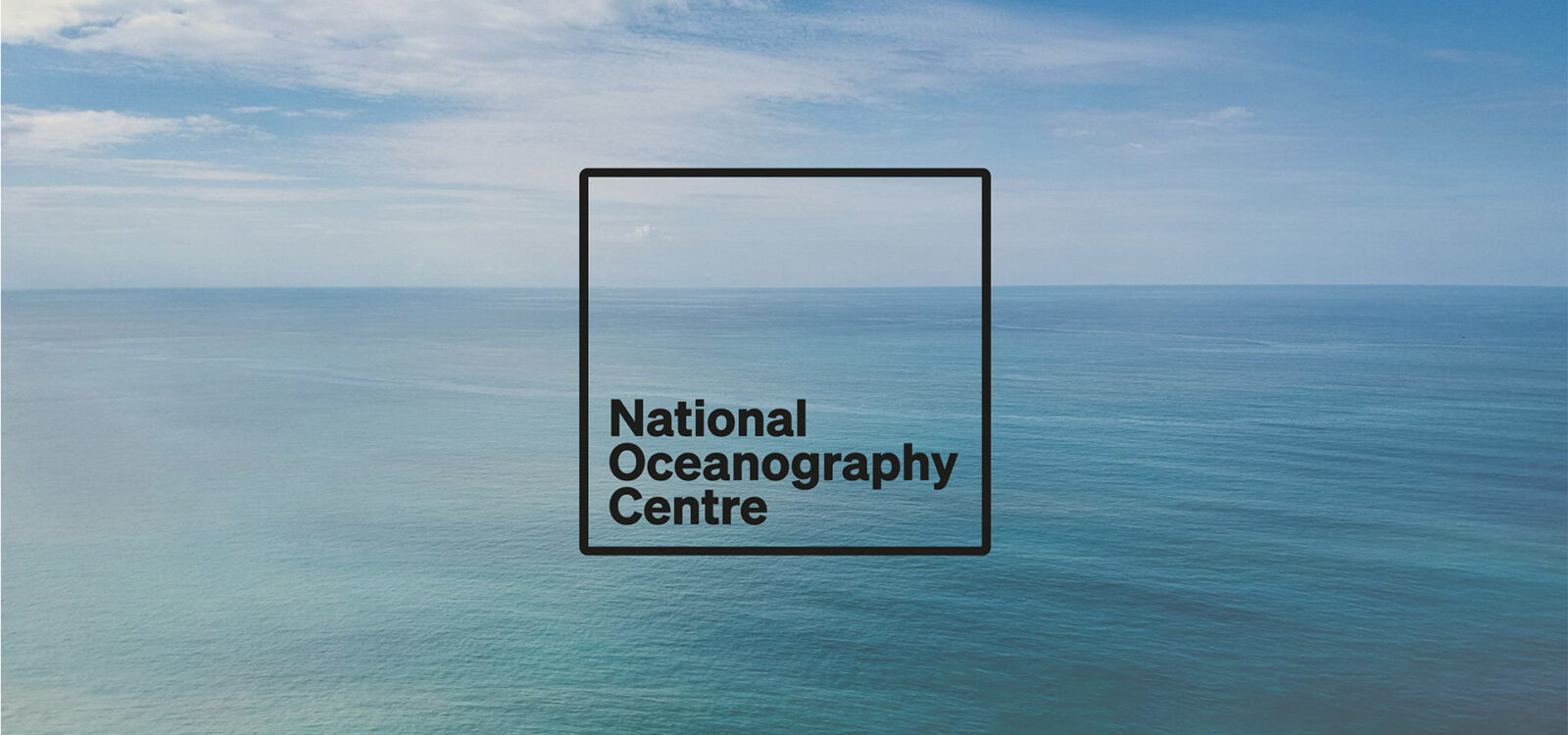
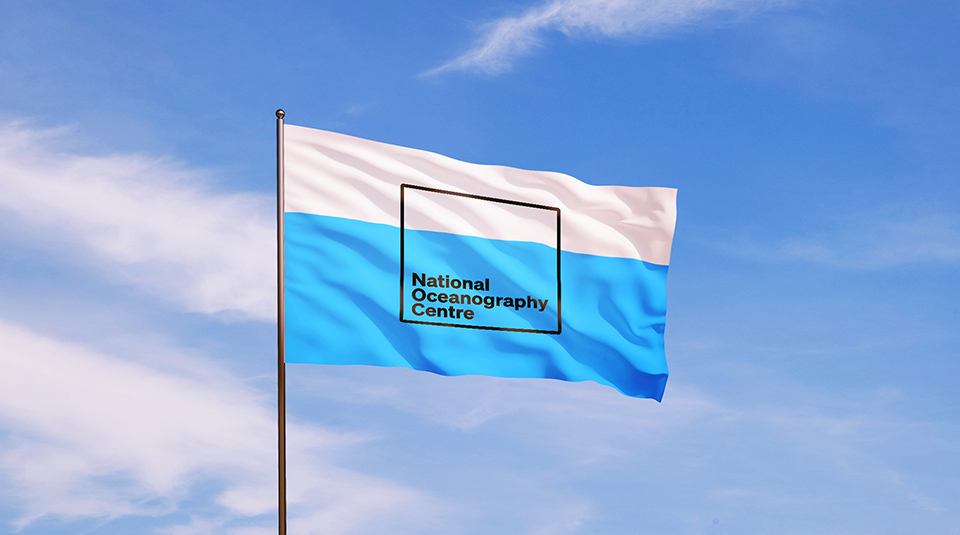
A logo to mirror our blue planet
We crafted a logo with a 70/30 ratio, mirroring the vast expanse of our planet covered by the ocean. The logo sits deep under a horizon line, as if it is submerged.
A vibrant visual and verbal identity
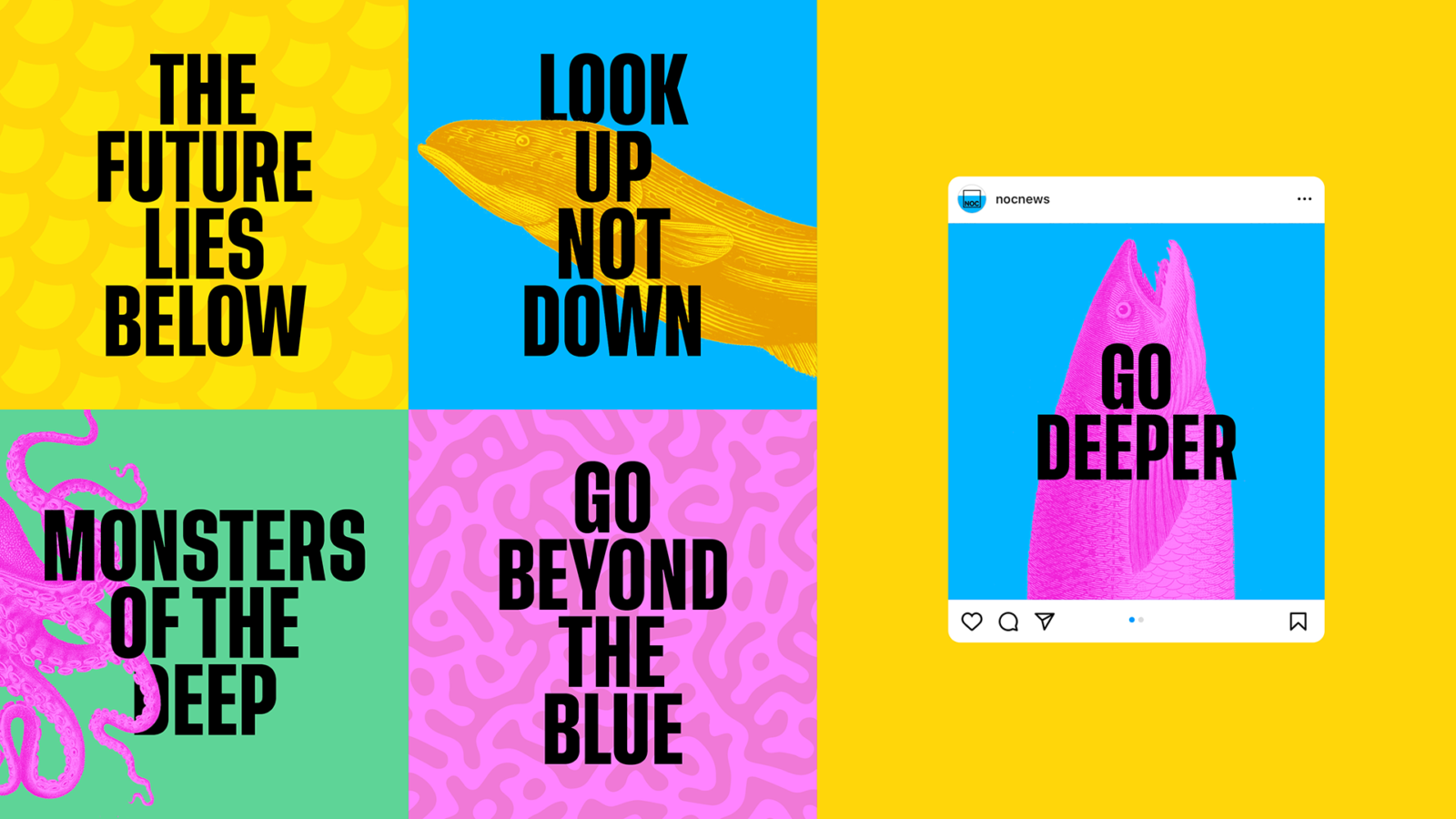
We championed NOC as the global authority on all things ocean through a crystal-clear, razor-sharp tone of voice – along with a bit of a well-placed wit to stand out in public.
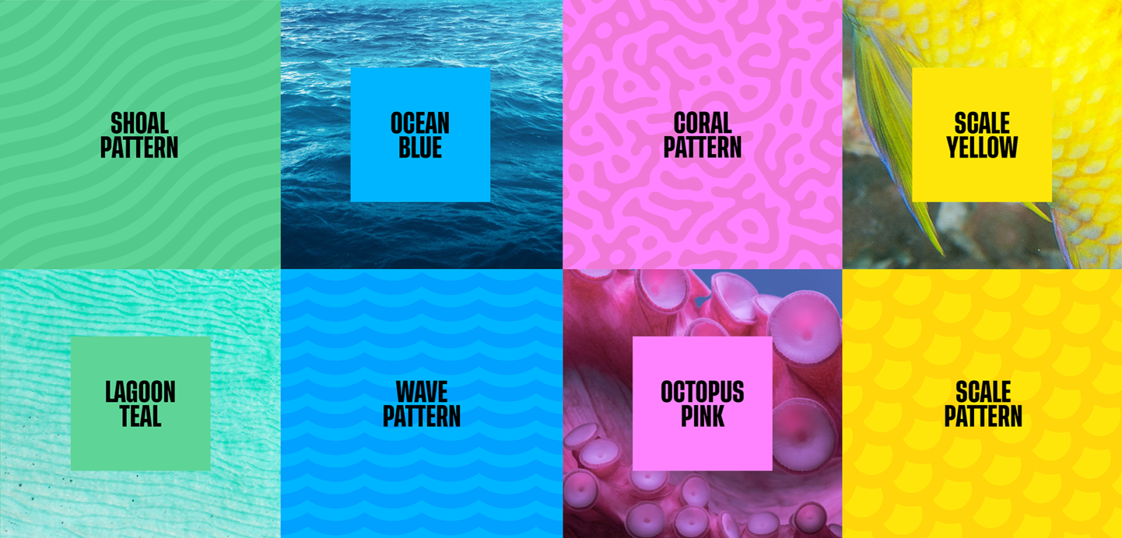
Colour palette, patterns and illustrations were inspired by the ocean. Blue is the primary colour. But, looking deeper, you’ll find a myriad of other colours in these waters. From the vibrant pink of an octopus to the vivid yellow scales of a tropical fish.
Illustrations were based on historical scientific drawings, which brought the sea to life in the early days of oceanic exploration. We reinvigorated them with punchy contrasting colours for greater visual impact.