CLIENT:
Make Shift
PROJECT:
Brand purpose & design
Purpose & identity
A consistent brand architecture
We had already supported Make Shift to launch a new organisational purpose and developed its brand idea ‘Champion Individuality’ which would be used as a common thread to support the launch of all future sites. Our challenge was therefore to apply this brand architecture and purpose whilst devising a distinct and exciting brand identity for Hackney Bridge.
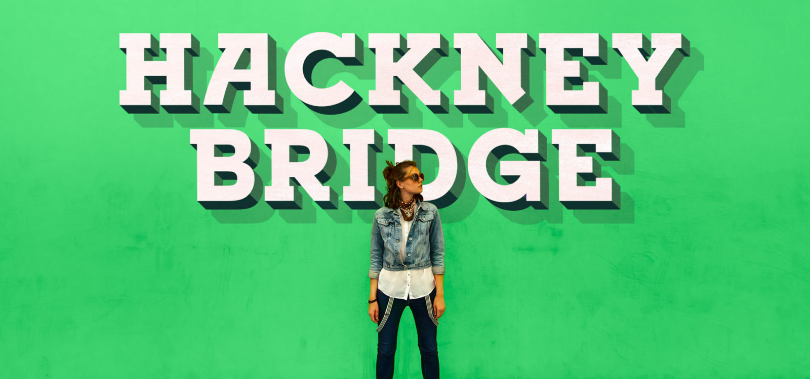
A bridge between old and new
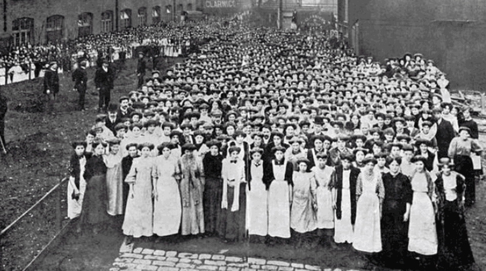
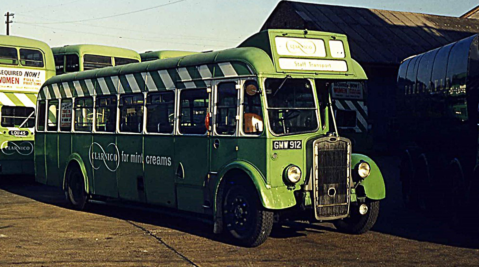
Consultation with locals identified a strong emotional attachment to the old Clarnico Sweet factory. We therefore worked to create a brand identity that paid homage to the past, whilst delivering a modern and ownable brand identity for Hackney Bridge.
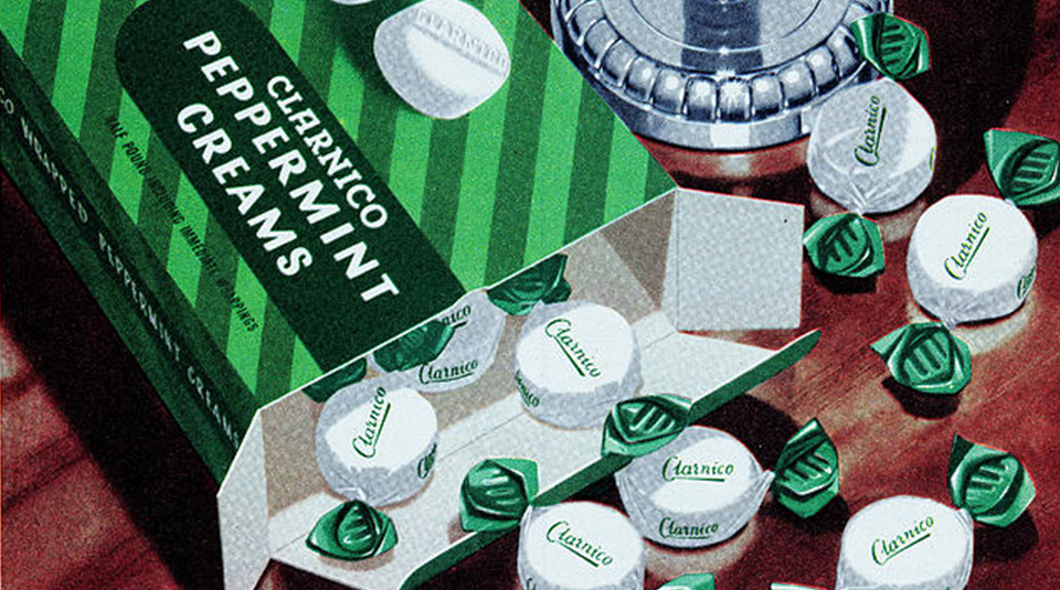
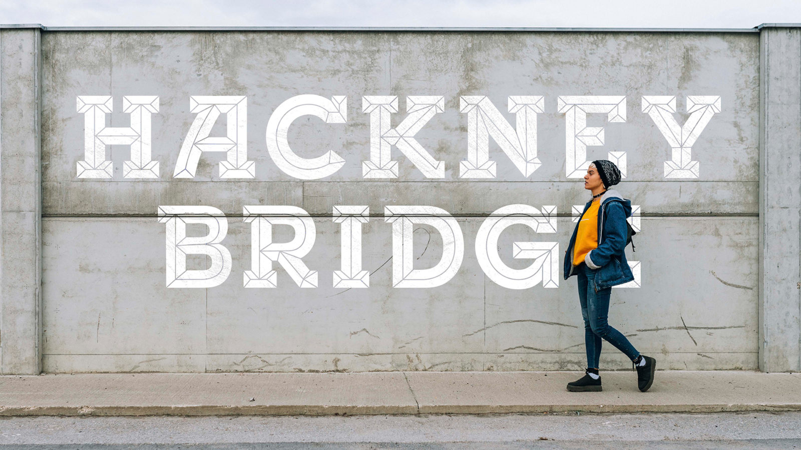
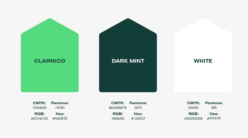
To do this, we took inspiration from the original letterforms used by the Clarnico company to design a unique new wordmark for Hackney Bridge. In our colour selection, we took inspiration from famous Clarnico exports of the past before adapting them into a modern design format for cut-through on screen and offline.
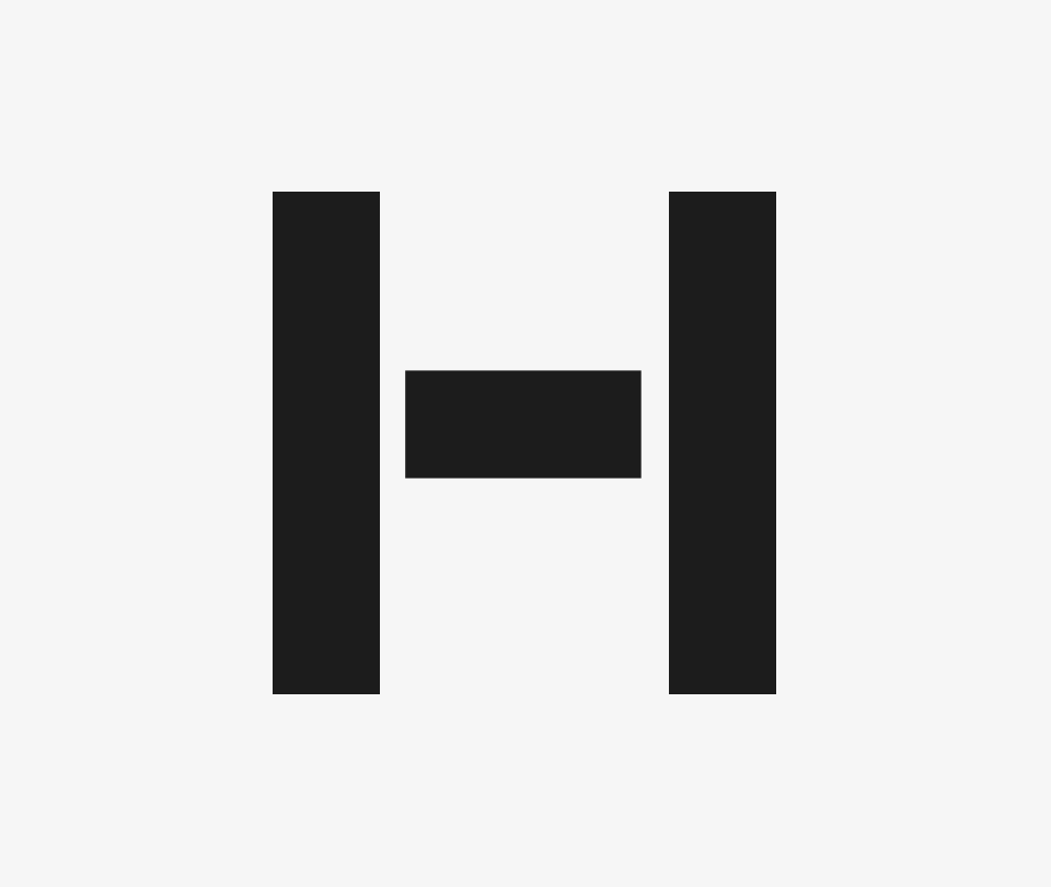
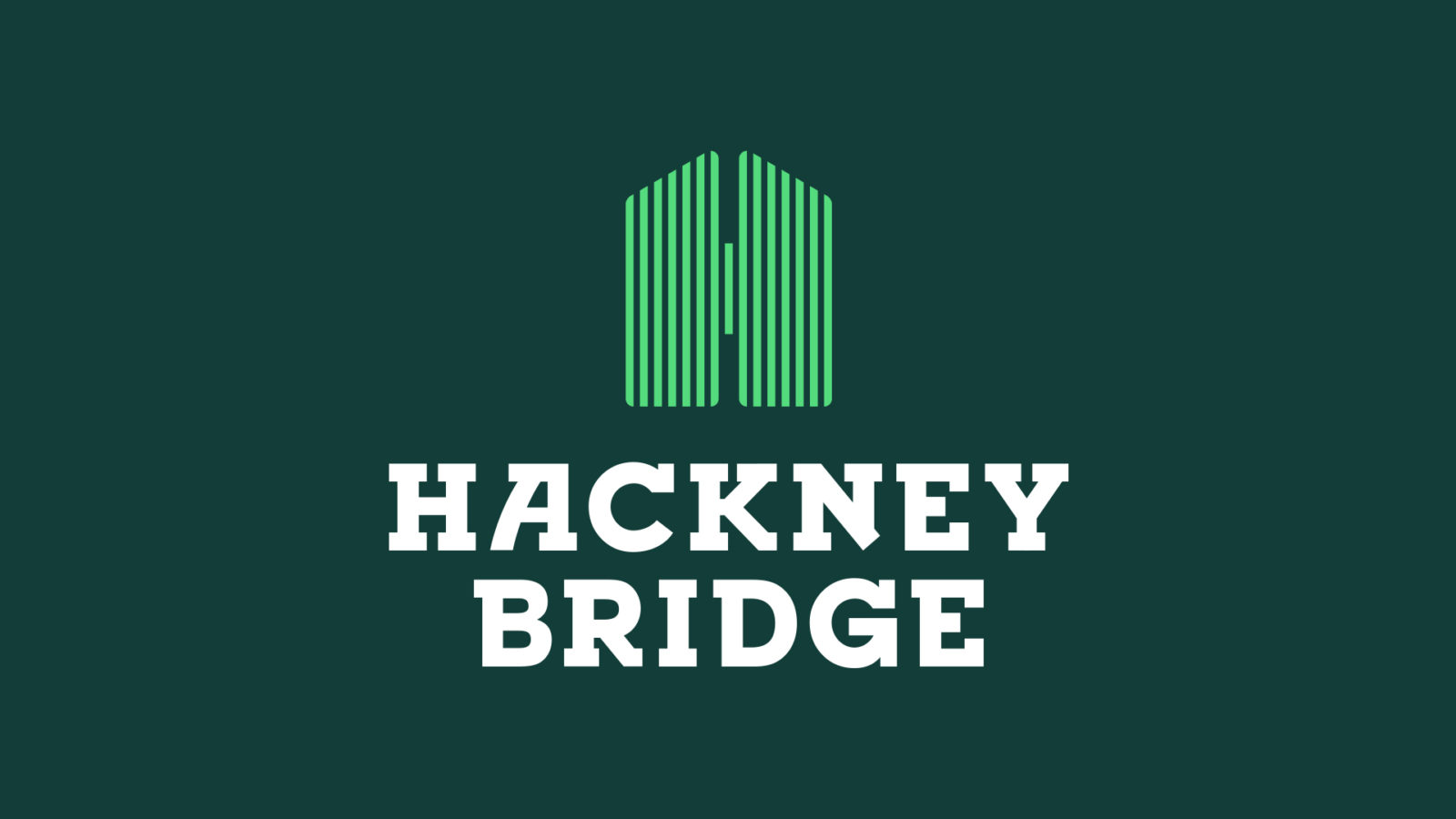
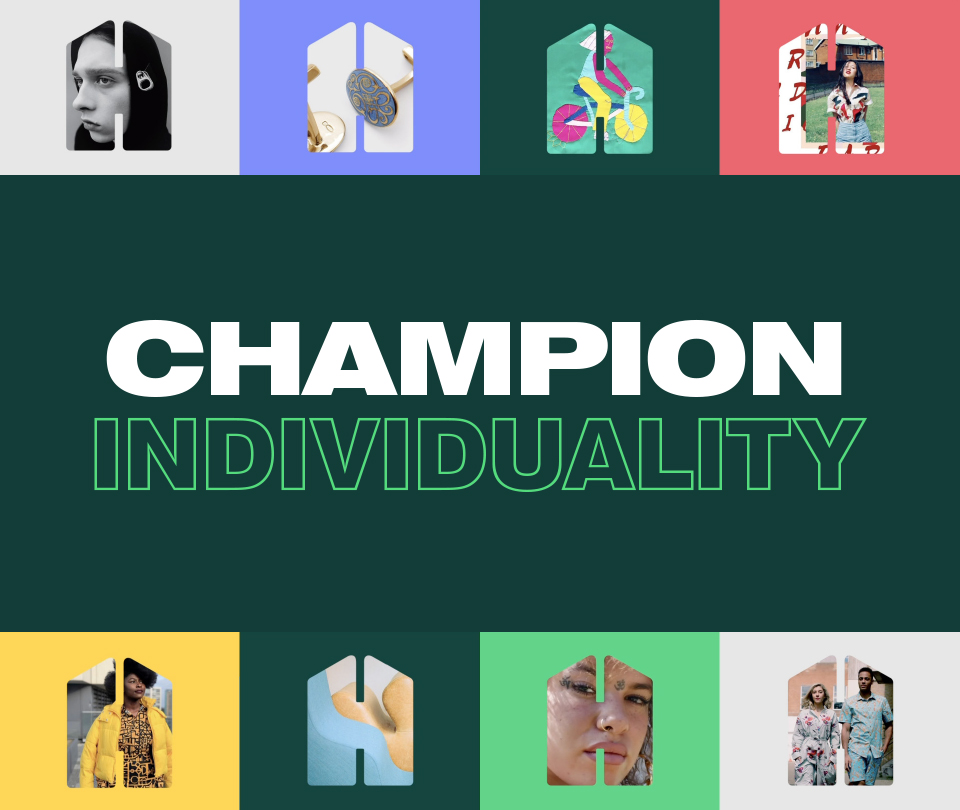
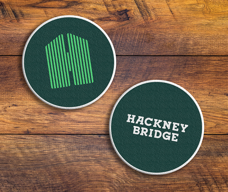
A symbol for individuality
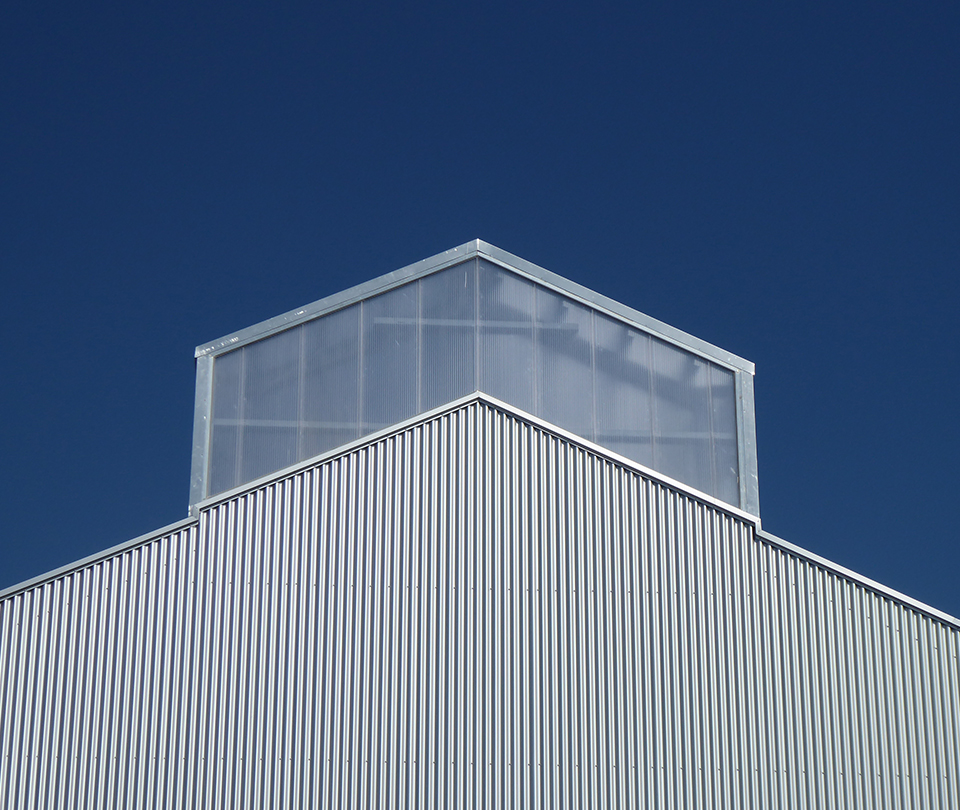
We wanted to create an ownable brand asset that could be used as a short-cut for the Hackney Bridge brand. We conceived an approach that would allow the ‘H’ from Hackney to mimic the name by ‘bridging’ two vertical stems with a horizontal bar, and used the Hackney Bridge architectural design as inspiration to build an angled roof and corrugated texture into the mark.
In doing so, we were able to create a memorable symbol that would help generate recall of the site, as well as a brand device that could hold different content and help champion members’ individuality.
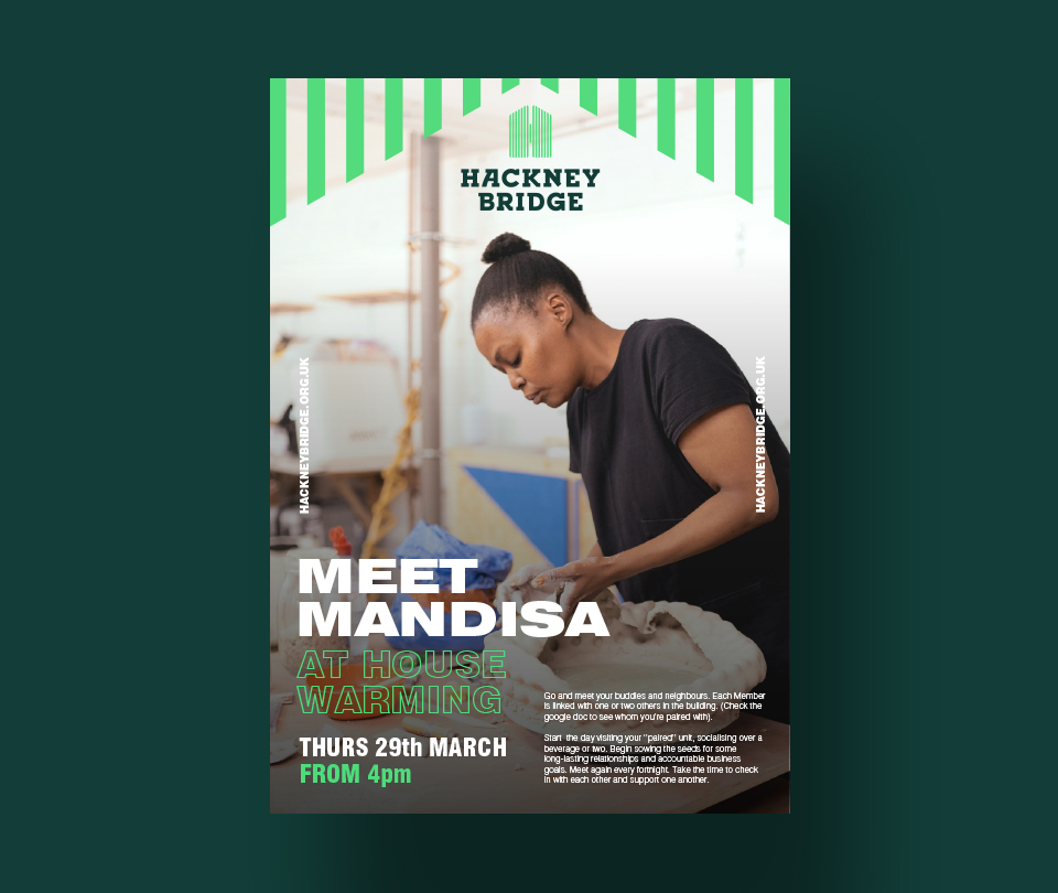
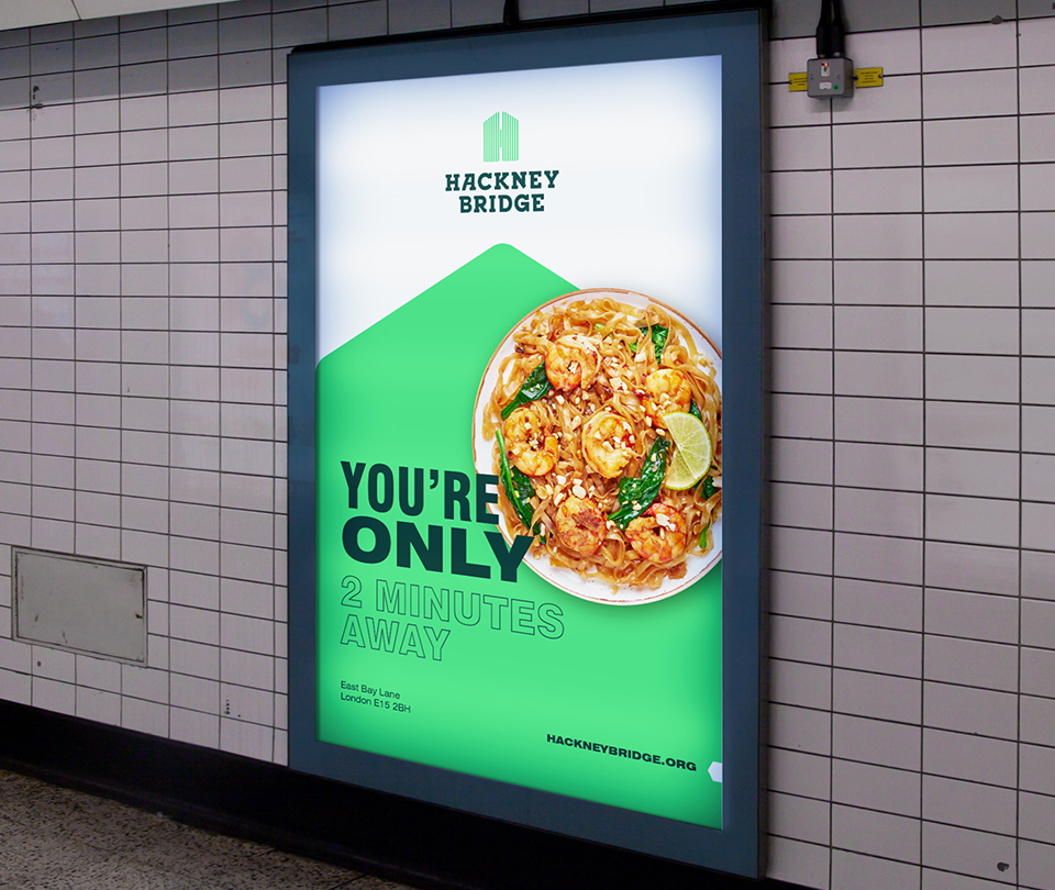
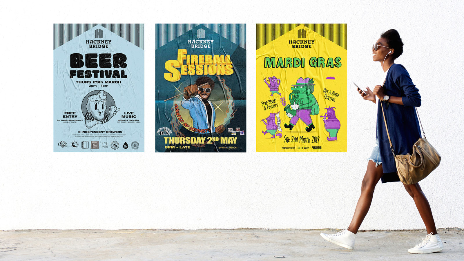
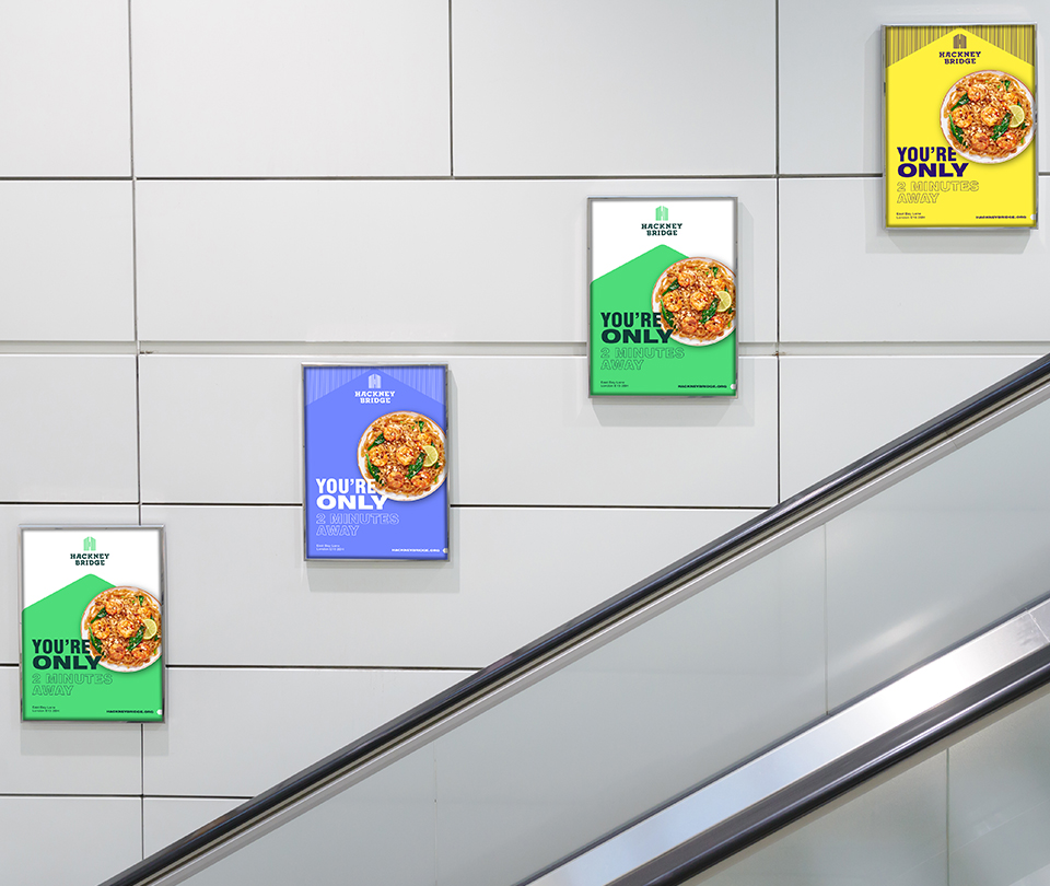
A unified and memorable graphic language
Following the creation of our symbol we created a series of ‘roof’ graphic devices that not only reflected the structures on site, but also what was going on inside those structures. This helped create a memorable graphic language and association to the site, as well as providing the opportunity for members and event partners to express themselves creatively.
A strong look
This project showcased the success of our new brand architecture, and validated its ability to ensure Make Shift and its sub-brands could live their brand purpose.